SWEETSTAY

The creation of a simple yet effective logo and branding, to represent a modern and respectable hospitality company.


THE BRAND

SWEETSTAY are a hospitality company based in London who specialise in sourcing short and medium term accommodation for professionals and holiday makers in different locations in Europe. They seek out the best homes, looking for space, character and comfort. Taking the best elements of hospitality and years of experience in property management, their goal is to offer hotel-quality home rentals.


brand-logo
APPROACH

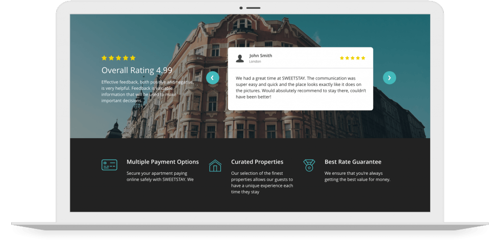
SWEETSTAY requested branding that would present them in a fresh and contemporary way. It was important that the brand appealed to all their target markets; landlords, professionals and holiday makers. From this brief our designers had the freedom to get creative with logos and colour schemes that could then be implemented onto stationary, marketing materials and a BookingSync website template.

ACTIONS

Our in-house designers collaborated with one another, conducting research and creating mood boards before starting work on the design of SWEETSTAY’s logo and branding. It was important that the logo portrayed SWEETSTAY’s service offering in a subtle and professional way, the outline of a house over ‘Stay’ was the perfect way to do this.


SWEETSTAY wanted to stand out amongst competitors, the use of turquoise throughout their logo and branding is visually enticing and fresh – just like the rental properties they offer! Once the logo and branding were approved, our designers implemented it onto the BookingSync website template and when creating bespoke stationary and marketing materials. The offering of additional services to customers is one of SWEETSTAY’s unique attributes, Foundry Digital created individual icons to represent each service in a bespoke way.

RESULT

SWEETSTAY’S logo and branding will ensure that they appeal to all their target audiences, and attain customer & client loyalty. Their logo and branding emanate a high-standard of professionalism, whilst simultaneously portraying their personable and approachable nature. The offering of additional services to customers is one of SWEETSTAY’s unique attributes, the individual icons created for each service help present their bespoke business. The design and creation of stationary and marketing materials, as well as the implementation of branding on a web template extend SWEETSTAY’s branding both online and on paper.

VIEW WEBSITE

A logo and branding as visually enticing and fresh as the rental properties they offer.

VIEW MORE PROJECTS